One of the big things that has plagued me has been "look" and iconography. I've seen some forum threads about the web get pretty headed when you talk about the correct markings and schemes for any Codex Chapter, but on the whole I've settled on using it as a guideline and ignoring it when it doesn't look right on a model - especially the matter of "company colours" which can lead to some very odd combinations. So really I've tried to settle on consistency over (alledged) accuracy. Mind you owning all the Dawn of War games has been a big help too!
Pics after the cut.
 |
| Obligatory Army shot. Feels like a lot, although on the 40k scale, it really isn't. |
 |
| Both Dreadnaughts - which I think nicely shows the move to a darker red overall, which I prefer. |
 |
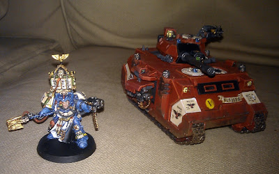
| Librarian and Predator |
 |
| 7th Squad, First Company Sternguard and Razorback Transport I like these guys, they were a lot of fun as a mini-project |
 |
| Tacs, Scouts and Force Commander. The latter may get replaced at some point and I fancy a Command Squad. |
 |
| What could be next? (Spoiler!) |
Impressive stuff. You're right about the red, it looks a lot better on the Venerable dread, whereas the regular dread looks a bit more "Blood Angely."
ReplyDeleteThe force is coming together nicely and makes me think I need more tanks...
i think the lightbox, whilst making for better pictures overall, does have a tendency to brighten everything up. once again i lament on the fact that photography seems to be a side hobby i'm slowly picking up as well.
Deleteand i'm now on the dangerous ground of thinking about getting sets for a Force Organisation Chart i'll never actually use...